 Deutschland
 España
 France
 Italia
 United Kingdom

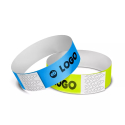
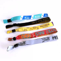
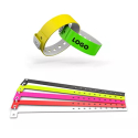
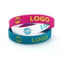










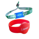
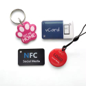
The essentials of choosing wristband colors for your event
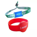
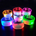
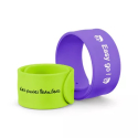
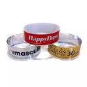
Color is one lever among several, and it fits within the broader range of choices behind custom printed wristbands and branding that let you combine tones, logos and finishes on every wrist.
- Recommended number of categories : limit your event to 3 to 5 color categories; beyond that, the coded system becomes confusing for both staff and attendees.
- Standard access color codes : green = VIP/all-access, blue = standard admission, yellow = staff/team, red = restricted zones; these conventional wristband colors speed up visual access control.
- Top legibility criterion : the most important readability factor is contrast between the wristband and attendees' clothing as well as the venue's lighting conditions.
- Main material options : Tyvek for single-day events, vinyl for multi-day events, and fabric for prestige or long-duration use; each material affects how colors appear.
- Brand identity consistency : align wristband colors with your visual identity by matching brand colors and exact Pantone references for a coherent event look.
- Color-code constancy rule : never change a color code mid-event, as reassigning the meaning of wristbands disrupts access verification and confuses staff.
- Why color coding matters : coded wristbands organize access levels at a glance, making color selection a functional decision as much as an aesthetic one.
Why Wristband Color Is a Lever for Your Visual Identity
Wristband colors do two jobs at once: they sort attendees by access level and they carry your event branding onto every wrist in the room. A well-chosen palette turns a simple admission tool into a visible extension of your identity, shaping the first impression long before a guest reaches the main stage. Color is only one part of the picture, since custom printed wristbands also let you carry logos and branding details onto every wrist alongside your palette.
Color as Both a Logistics Tool and a Branding Asset
Most event managers think of wristbands as a control device first. That view sells them short. The same band that lets your gate staff read access in a glance also broadcasts your color scheme across the whole site. When the tones match your visual identity, the logistical layer and the branding layer reinforce each other instead of competing.
The practical benefit is real: a color-coded wristband system works best with three to five distinct categories, so each tone stays meaningful for your staff while still echoing your palette. Push past that range and you lose both readability and brand coherence.
- Faster access checks, because each color maps to one role your team recognizes instantly
- Stronger brand recall, since attendees wear your tones for the full event
- A more memorable look in photos and social posts shared by participants
- Clearer segmentation between tiers without extra signage at every gate
What Color Communicates at a Glance
Before anyone reads a label, color sends a signal. A green band reads as privilege when it marks your VIPs, while red carries excitement and urgency by nature. Your attendees process these cues in a fraction of a second, which is why the tones you assign should feel deliberate rather than left over from a supplier's stock.
Treat each color as a small promise about who the wearer is and what they can access. Get that mapping right, and the wristband becomes a quiet but constant expression of how your event is organized and how it wants to be seen.
Aligning Wristband Colors With Your Style Guide
To align wristband colors with your visual identity, build your selection on three layers: your brand palette, the meaning each color carries, and a documented reference system. Wristband colors only reinforce your event branding when each tone maps to one role and matches your brand guide. The method below keeps that link clear and consistent.
Starting From Your Brand's Primary and Secondary Colors
Your primary brand colors should carry the most visible tiers, the ones attendees and staff see constantly. Reserve your secondary palette for supporting roles. The goal is a cohesive look that feels like an extension of your identity, not a random set of bands bought off a shelf.
- List your primary and secondary brand colors with their exact references.
- Match your most-used access tier to a primary color.
- Assign secondary tones to lower-frequency roles.
- Check the contrast between any two adjacent tiers before locking the scheme.
- Validate the printed result against a physical sample, not a screen.
Using Color Psychology
Color carries instant meaning, and creating a scheme that respects common associations makes your system easier to read. Green reads as VIP or all-access, blue suits standard admission, yellow works for staff or crew, and red signals restricted areas. Lean on these conventions when they fit your palette, since they make the wristband memorable and intuitive at the gate. When a brand color clashes with an expected meaning, keep the brand tone but back it up with a printed label so staff are never guessing.
Building a Cohesive Style Guide (Pantone, RAL)
A documented reference is what protects your identity across every reorder and supplier. Record each color in a fixed format so the result stays identical from one production run to the next.
Pantone: a standardized color matching system used to specify an exact ink reference. RAL: a color standard widely used for coated and molded materials.
- Note the Pantone or RAL reference next to each access tier.
- Pair every color with its role in a short access chart shared with your team.
- Keep the same references across signage, briefings and the bands themselves.
This single document turns scattered choices into a system. It keeps your wristband colors faithful to your brand while staying readable under real event conditions, which is exactly the balance every event manager needs.
Defining a Color System by Access Level
An access-based color system assigns one wristband tone to each participant category, so your staff can verify entry rights at a glance. The principle is simple: each color maps to a single role, the meaning stays fixed everywhere, and your gate teams read it instantly without second-guessing.
Standard Color Codes by Category (VIP, Staff, Standard)
Most events rely on a small set of coded conventions that attendees and staff already recognize. Green is often reserved for VIPs, as it symbolizes access and privilege. Blue works well as a neutral choice for general attendees, while yellow is commonly used for staff or crew, and sometimes for children or guests with limited access.
- Green: VIP or all-access guests
- Blue: standard admission and general attendees
- Yellow: staff, crew, or guests with limited access
Lock these meanings before you order, then keep them identical across briefings, signage and the wristbands themselves. A color that shifts meaning between two gates breaks the entire logic.
How Many Colors Should You Use?
Most events run smoothly with three to five color categories. Beyond that range, your access staff slow down and checks become error-prone at every entry point. Each tone should carry one distinct role, never two. If your structure genuinely needs more tiers than five colors allow, reinforce the bands with printed labels or icons instead of inventing a sixth color that nobody remembers.
Segmentation and Access Management
Start from how your event actually segments people: paying public, premium guests, internal teams, performers, suppliers. Translate that segmentation into your coded palette, then map each zone of your venue to the colors allowed inside it. This turns a visual identity choice into a working security tool: a quick glance tells your team whether a participant belongs in a given area.
The exact setup depends on your event. Durations, layout and the number of access tiers vary case by case, so the precise color-to-zone matrix is best defined on request, based on the structure you actually run. Keep the chart short, share it with every team, and train your gates before doors open.
Which Wristband Colors Actually Work in Real Conditions
The colors that perform on site are the ones that hold strong contrast against clothing and lighting, not simply the brightest tones. A wristband only stays readable when your staff can tell two tiers apart at a glance, under the exact light your venue throws at the gate.
Contrast First: Clothing and Lighting
Attendees rarely dress in neutral tones, so a color that reads cleanly in a briefing room can vanish against a dark jacket or a bright festival outfit. Tonal contrast between adjacent access tiers matters more than the saturation of any single wristband color. Test each band against the kind of clothing your crowd actually wears, and check it under the lighting at your control points rather than under office light.
Saturated Colors Versus Light Tones
Saturated colors carry the coded meaning across a venue: a deep green VIP band stays distinct from a blue standard-admission band even at distance. Pastels and light tones tend to blur together once light drops or once a band sits against pale skin or white sleeves. Keep your most safety-critical tiers, such as restricted-area red, in fully saturated shades, and leave softer tones for low-stakes categories where a misread costs little.
Visibility Indoors, Outdoors and at Night
Each environment changes how a color is perceived, so plan the view your staff will get in context:
- Indoor venues: stage washes and colored gels distort tones. Favor strong contrast and add an icon or label so the band stays memorable under shifting light.
- Daytime outdoor events: direct sun flattens pastels. Saturated colors hold their coded role best.
- Night and low light: reds and greens become hard to separate. Pair them with text, a printed symbol or differing band widths.
- Mixed-zone festivals: keep the same access colors consistent across every gate so staff read them instantly.
Whatever the setting, confirm each band in the real space before doors open.
Choosing the Material: Tyvek, Vinyl, Silicone or Fabric
The material you pick changes how your colors read and how long they last. Plastic wristbands are rated for two to five days of continuous wear. Match the material to your event duration, your budget and the level of finish you want your colors to convey on the wrist.
Each material renders color differently. Tyvek prints flat and matte, vinyl holds saturated tones, silicone keeps color through heavy handling, and sublimation on fabric carries the sharpest, most detailed result. Exact durations and pricing depend on the configuration you order, so those details are set on quote based on your specific run.
Tyvek: Affordable for Single-Day Events
Tyvek is the budget choice for one-day events. This synthetic paper tears on removal, which prevents reuse and keeps your access control tight for a single session. Colors print clearly but stay matte, so they suit high-volume entry where cost per band matters more than premium feel. For a festival day pass or a one-off conference, Tyvek covers the basics without overspending.
Vinyl: Durable and Professional Across Several Days
Vinyl moves up a tier in durability. The plastic surface resists water, sweat and stretching, so colors stay vivid across a multi-day pass. Vinyl bands hold saturated tones well, which makes them reliable when you separate access tiers by color under changing light. They read as more professional than Tyvek and tolerate repeated checks at the gate without fading or fraying.
Silicone: Robust and Hard to Counterfeit
Silicone bands are the sturdiest option and double as a keepsake guests often wear after the event. The closed-loop design is difficult to falsify, which strengthens your security on restricted-access tiers. Colors are molded into the band rather than printed on top, so they never wear off. The trade-off is a higher unit cost, which makes silicone best for premium passes or recurring events where the band carries lasting brand value.
Sublimation Fabric: Prestige, Comfort and Long-Term Visibility
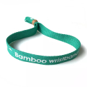
Sublimation fabric delivers the most upscale result. The dye bonds into the woven thread, so your colors and any logo stay crisp and full-color for the entire run. These bands feel soft on the wrist, which guests appreciate across multiple days, and the slim woven profile reads as premium. Sublimation on fabric produces the sharpest, most detailed color of any wristband material. For VIP tiers, sponsor activations or any event where the band reflects your identity, fabric is the strongest pick.
Reinforce Security and Experience With Consistent Colors
A well-built color system does more than look clean: it cuts fraud, speeds up entry checks and makes your event instantly recognizable. Consistent coded colors let access staff validate each guest at a glance, without slowing the line at the gate. The same palette then carries your identity well beyond the entrance.
Hard-to-Counterfeit Colors and Access Control
Pairing precise tones with secure materials makes a wristband far harder to replicate on the spot. When every color maps to one access level, your team spots an out-of-place band immediately, and restricted zones stay protected. To strengthen control across your gates, focus on:
- Custom Pantone references rather than generic shades anyone can source
- A single role per color, so any mismatch flags a security risk
- Printed text or icons layered onto the band as a second verification cue
- Sealing closures that break if the band is removed, preventing reuse
Extend Your Visual Identity Onto Merchandise
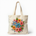
The colors guests wear on their wrist should echo across your wider merchandise range. When your wristband palette matches your tote bags, lanyards and tees, every item reads as part of one coherent brand. That continuity makes your event more memorable and turns each piece into a quiet ambassador long after the gates close. Lock your references once, then apply them to every promotional object you produce.
Maximize Visibility on Social Media
Strong, on-brand colors photograph well and travel fast. Attendees raising a vivid wristband in a crowd shot give you free reach across social media, with your identity baked into every frame. Choose tones that stay true under stage lighting and on camera, so user-generated content stays recognizably yours. A wristband that looks great on screen keeps your brand circulating well after the last entry has been scanned.
Best Practices for an Effective Color System
An effective wristband color system rests on three pillars: consistency, accessibility and prior testing. Lock each color to a single access role and keep it identical across signage, briefings and the bands themselves. The checklist below gives your event team concrete rules to apply before opening the gates.
Keep a Consistent Color Code
- Document each color and its access role in one short reference chart, then share it with every gate operator.
- Never reassign a color mid-event: if green means VIP, it stays VIP from setup to teardown.
- Stay within three to five categories so staff read each band instantly without hesitation.
- Match the band tones to your style guide once, and reuse the exact references for future editions.
Plan for Accessibility (Color Blindness)
Roughly one man in twelve perceives reds and greens differently, so color alone is never enough to separate adjacent tiers.
- Pair every coded color with a printed label, icon or number for participants who cannot rely on the hue.
- Keep strong tonal contrast between neighbouring tiers rather than betting on brightness.
- Avoid placing red and green on two access levels your staff must distinguish quickly.
Test Before the Big Day
A swatch on a monitor rarely renders the same once produced, so validation matters as much as design.
- Order a sample batch and confirm the printed result matches your screen reference.
- Check each band under real conditions: stage lighting, low indoor light and bright daylight.
- Run a short gate simulation so operators confirm they read every color at a glance.
- For multi-day passes, verify the colors stay legible after wear across the full event run.
Treat this checklist as a fixed routine for each edition, and your access control stays clear from the first guest to the last.
Frequently Asked Questions About Choosing Wristband Colors
Choosing wristband colors comes down to three things: matching your brand palette, assigning one clear meaning per color, and keeping the total number of categories small enough to read at a glance. The answers below cover the questions event managers ask most often.
How Many Wristband Colors Should You Use for an Event?
Most events run smoothly with three to five color categories. Staying within this range keeps your checkpoints fast and your staff confident. Beyond five colors, the system becomes harder to memorize and access checks slow down at the gate. Assign one role per color and document it in a short access chart shared with every team.
Which Color for VIPs?
Green is the conventional choice for top-tier access. Green is often reserved for VIPs, as it symbolizes access and privilege. In many coded systems green stands for VIP or all-access, blue for standard admission, yellow for staff or crew, and red for restricted areas. Pick the convention that fits your event and apply it consistently across every entrance.
How Do You Match Wristbands to Your Style Guide?
Start from your existing brand palette and pull your wristband colors directly from it, then map each tone to an access tier. The goal is for the bands to feel like part of the event identity rather than a separate signage element. Order a sample batch and check the printed colors under real lighting, since a swatch on screen rarely matches the final result.
Which Material Should You Choose for a Multi-Day Event?
For events spanning several days, durability matters more than for a single afternoon. Plastic wristbands are rated for two to five days of continuous wear. Tyvek suits short events on a budget, vinyl holds up well across multiple days, and fabric bands offer a premium feel for longer festivals. Match the material to your event length and the look you want on the wrist.
Are Bright Colors Always More Visible?
Not necessarily. Strong tonal contrast matters more than raw brightness, especially under stage lighting or in dim indoor settings. Avoid pairing red and green as your only distinction between adjacent tiers, since roughly one man in twelve perceives them differently. Reinforce each band with printed text or an icon so the access level stays legible regardless of lighting.